While developing Center Centre’s Presenting course, something popped into my head (that happens a lot when I’m immersed in curriculum design). I realized that I can analyze the color of sticky notes to ensure that I’m providing our students with diverse learning resources.
During each course, Center Centre students choose from an array of learning experiences and projects. We don’t require students to use one, pre-determined resource when they learn a topic. We provide a range of suggested learning resources like books, articles, podcasts, and videos. With the guidance of their facilitators, students choose what resources work best for their learning.
As we build each course at Center Centre, we collect many learning resources for the students. I find that using sticky notes works best for my collection process. I jot down what I learn from each resource on sticky notes. Each sticky note contains information that supports the learning goals for the course.
For example, while developing our User Research Practices course, I wrote, “The goal of user interviews is to uncover users’ pain points” on one of the stickies. I wrote, “Up front research provides a basis for decision-making that makes the rest of the work go faster” on another sticky note. Both pieces of information are part of the foundational knowledge of the course. A few years after students complete the course, when they are working as junior UX designers, we want them to remember this information.
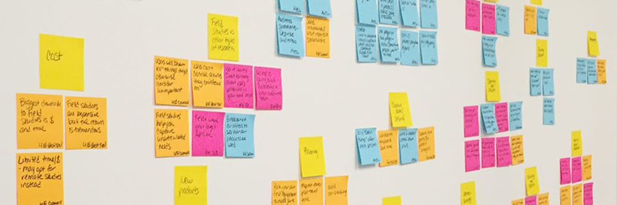
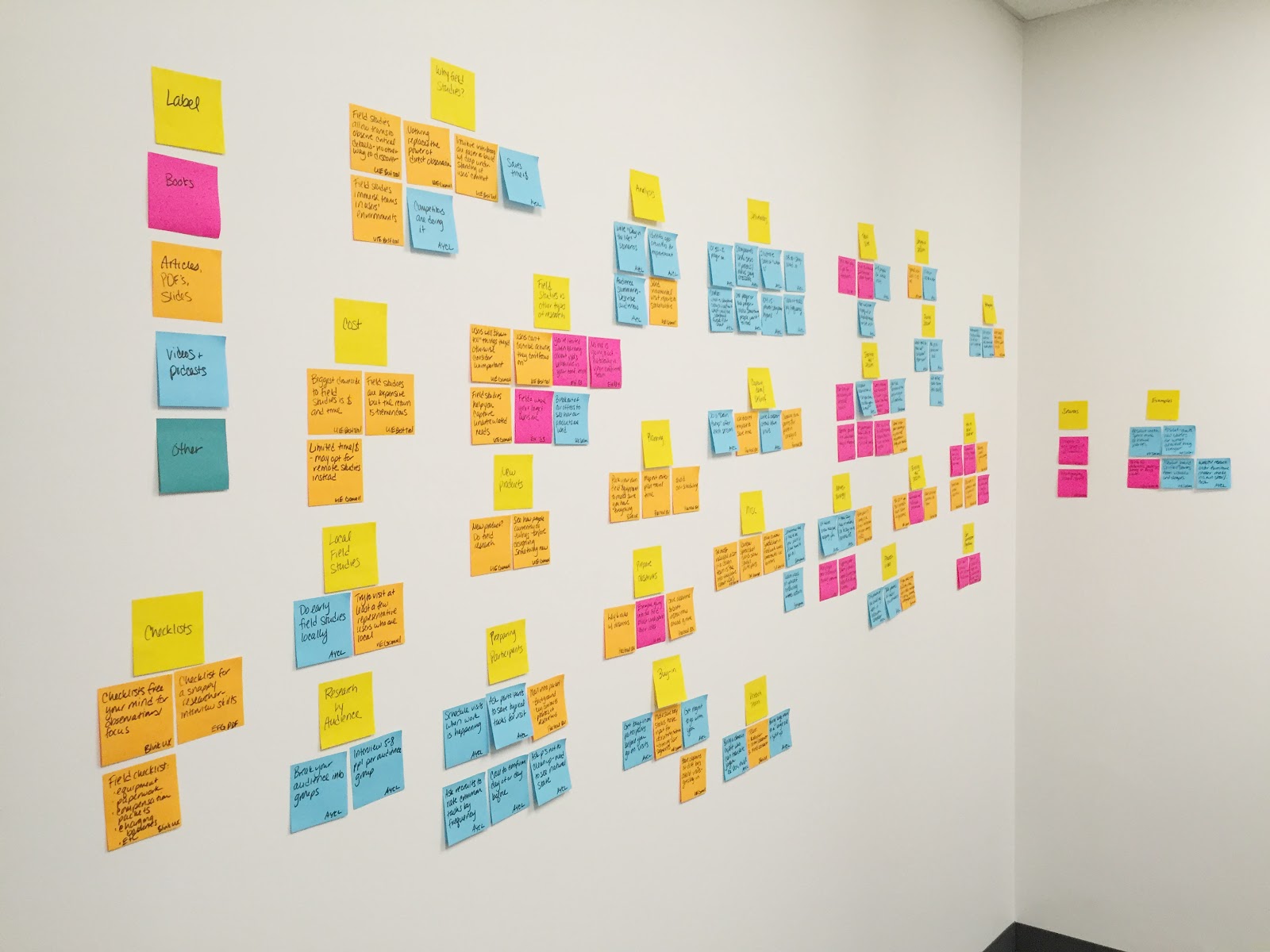
I put all of the resource sticky notes on the wall to make an affinity diagram. I arrange similar notes into categories called clusters, and I label the clusters. When I look at the clusters on the wall, I can see the main course concepts. And I can easily see if we are providing students diverse learning resources.
 I make an affinity diagram on the wall with all of the resource sticky notes.
I use different color sticky notes for each type of learning resource. I can tell if I’m using a variety of learning resources based on the colors of sticky notes. I typically use pink stickies for books, orange for articles, and blue for audio and video. If a cluster of stickies contains multiple colors, I know that cluster contains diverse resources. If the cluster contains only one or two colors, I need to find different types of learning resources.
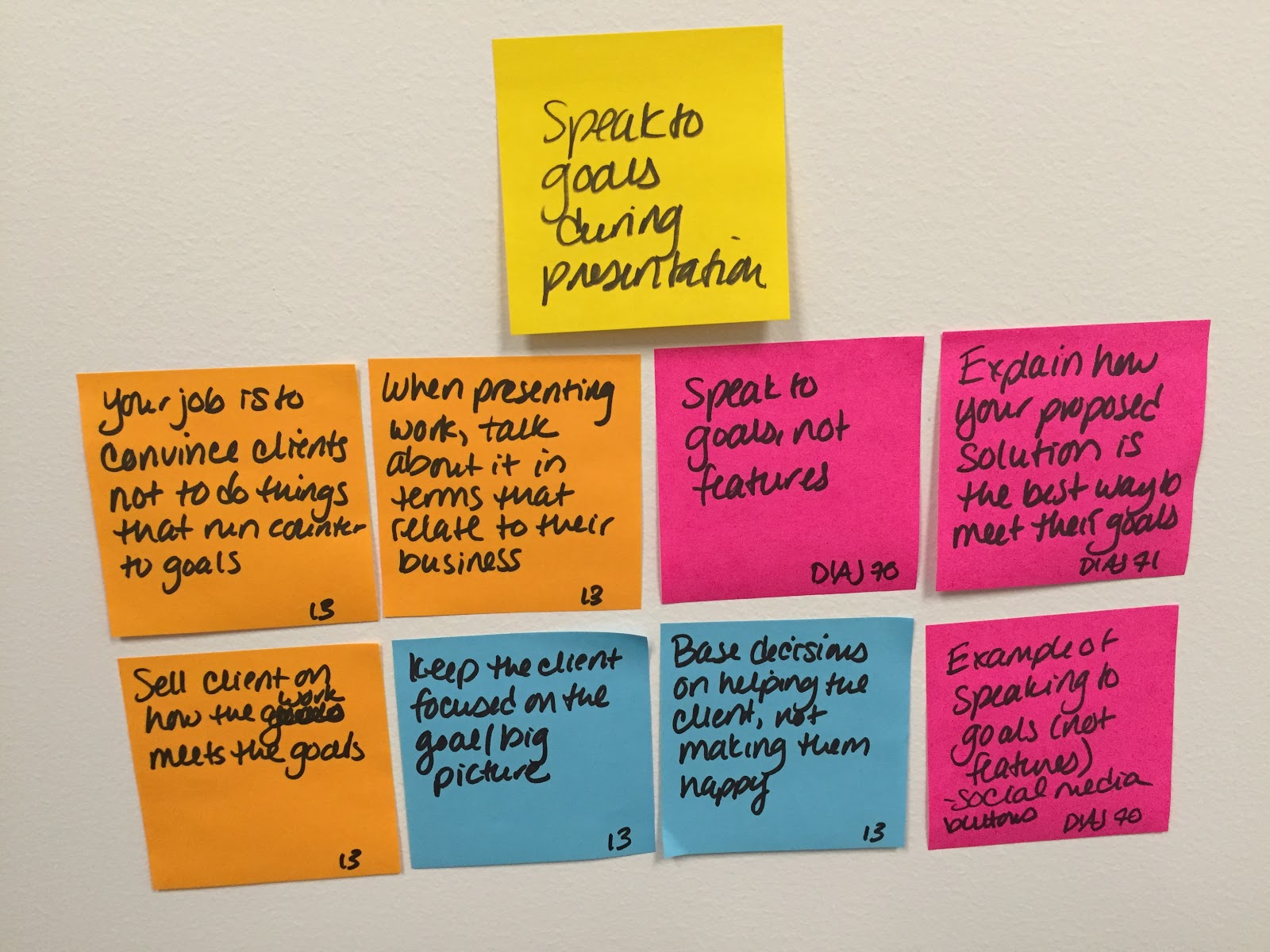
I recently worked on our Presenting course. In this course, students learn how to present their ideas. They also learn how to sell their ideas to stakeholders. While refining this course, I realized that some clusters about presenting work to stakeholders were missing blue sticky notes. Because of my sticky note process, I knew I needed to gather more audio and video resources.
 After adding content from Mike Monteiro’s presentation to the wall, I saw more blue sticky notes. This meant I had a variety of learning resources on the topic.
I learned how to make an affinity diagram years ago when I was a junior UX designer. Throughout my career, I’ve used affinity diagrams to develop site maps, analyze user research findings, and brainstorm ideas with a group. Now, I use affinity diagrams to develop our curriculum—a curriculum intentionally designed to support personalized learning. Albeit a bit meta, it’s rewarding to use UX practices to design our UX curriculum.
Apply to be a student Would you like to attend Center Centre as a student? You’ll learn user research skills, presentation skills, and much more. View our full program or apply today.

