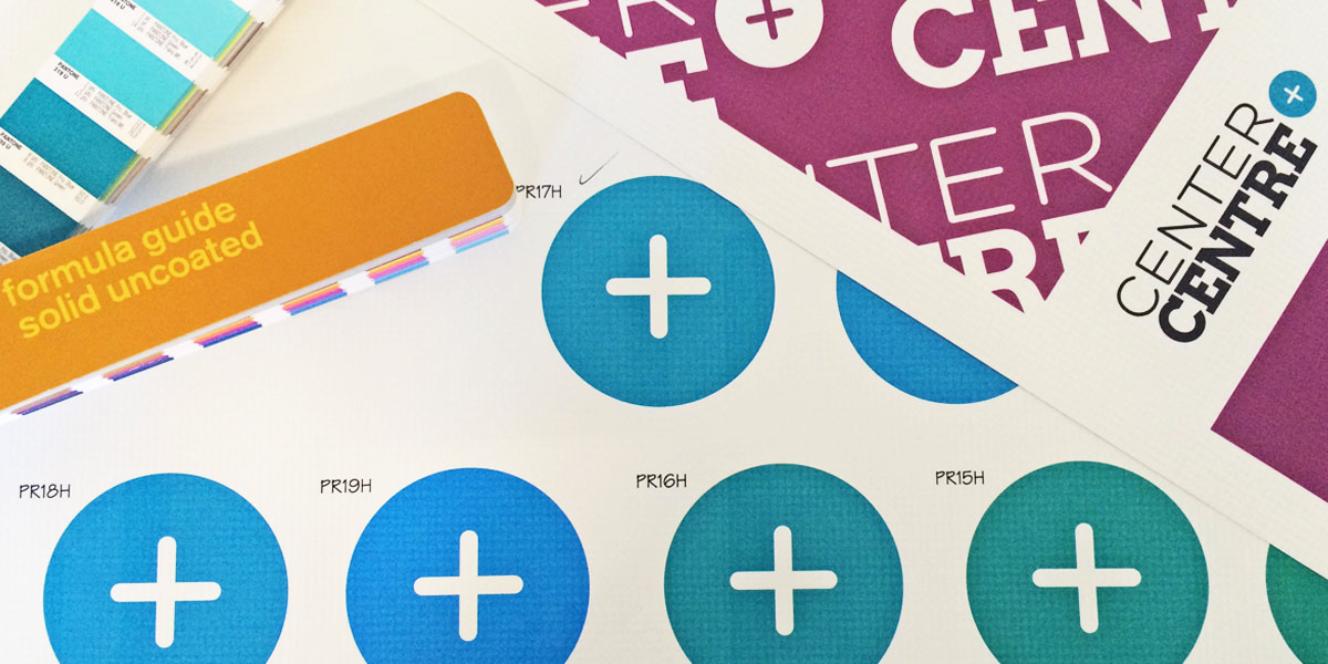
At Center Centre, we use an iterative design process for just about everything we do. Iterating allows us to measure our progress and learn from our mistakes. We test big ideas using iteration. We also fine tune details like wording, size, and even color through iteration.
Working with color through iteration
As Center Centre’s in-house designer, I led the design of our first outdoor banner. Throughout this project, I collaborated with Scenic City Signs, a sign and graphics company in Chattanooga. We went through many design iterations before finding the right colors and the right design for our banner.
I find it extremely beneficial to work through the iteration process with experts and mentors. For the banner project, I choose to collaborate with Scenic City Signs in Chattanooga. I knew their domain knowledge of the printing processes would help me to make better design decisions. Having a proper sounding board can help you as the designer feel more confident about your final design.
Together, Scenic City Signs and I used this iterative process to choose the right colors:
- Plan a color.
- Implement the color outdoors as a test. (We place it temporarily on the wall and view it from different distances.)
- Measure how closely the color matches our brand colors.
- Learn from the process to determine the next step.
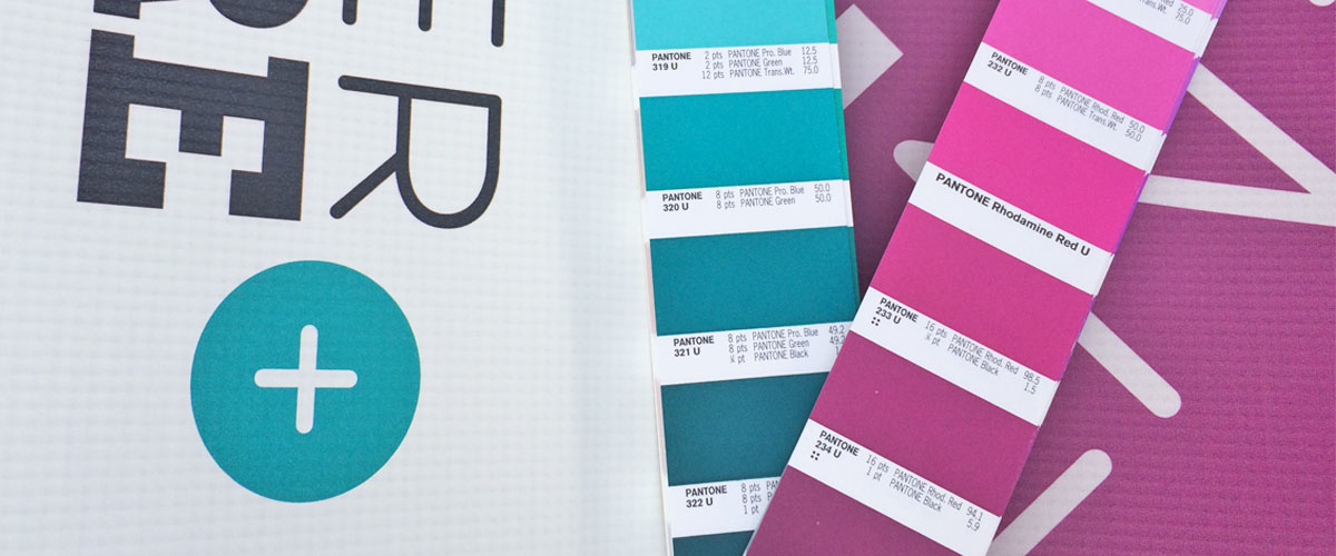
 I used these strips to choose the correct PANTONE blue and purple.
Throughout this process, I learned more by working with an expert than I would have learned by myself. I made more confident decisions. I also learned a few tricks about creating outdoor signage:
- As colors vary from print to screen, they also vary on textures of print materials. The textured material on our sign makes Center Centre’s Pantone purple look lighter than it should. We used a darker shade of purple to adjust for the color difference.
- Center Centre’s Pantone blue looks great indoors under our LED lights. However, when you view it outdoors in sunlight, our blue looks warmer than it looks inside. Through iteration, we found a Pantone blue that looks cooler and great in the sun.

Using an iterative process with our students
After we printed, completed, and installed the banner, Eddie, a print professional at Scenic City signs, said to me, “Please tell me you’ll teach students the difference between screen colors and print colors.”
I smiled.
Our curriculum doesn’t include print design, but our students will learn about the use of color when designing for screens. Our students will also learn to develop their designs using an iterative process.
Students will learn when to work with experts. At some point during their time at Center Centre or during their careers, they’ll encounter projects that require mentorship from someone with more experience. Knowing when to consult an expert and when to try something on your own is an invaluable skill.
Apply to be a student
Do you want to learn from leading industry experts? Would you like to learn more about working through problems using an iteration process? Become a Center Centre student. View our full program or apply today.


 If you’re like me, you’ve probably set a few goals for the new year. Maybe you want to add more healthful foods to your diet. Maybe you want to get better at speaking a second language. Maybe you want to learn a new skill to help you grow professionally.
As UX designers, we often need to learn new skills. Even if we don’t realize it, we’re constantly learning.
We often learn things when we need to. Remember the last time you were in a crunch to learn something so you could solve a new problem, or solve a familiar problem with a better solution? You might have learned something quickly, applied it right away, and moved on with your day. You might not have paid attention to your process of learning.
Over the next year, take a few moments to pause and think about how you learn best. Then, consider how to apply your successful learning approaches the next time you need to learn something new.