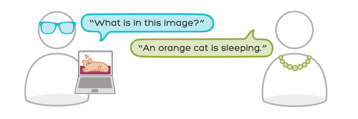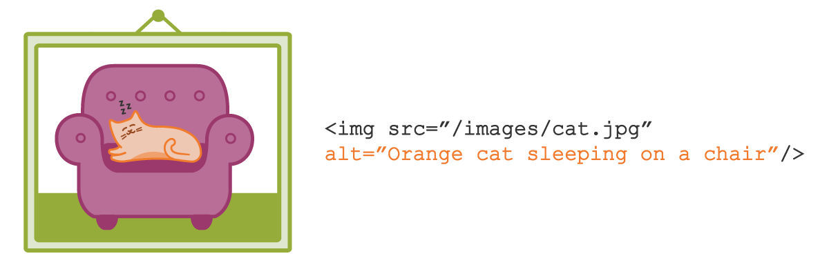
Clear, conversational writing helps users understand what they read on your website. It also helps users understand the content in your images’ alt text.
Alt text is more than just a few words that you quickly add to an image attribute. Images, like text, are part of your site’s content. When people can’t access the images on your site, alt text helps them understand your content.
In her accessibility guide, Accessibility Teaching Resources, Virginia DeBolt explains how you can write meaningful, useful alt text:
Think about alt text by imagining you are reading a web page to someone over the phone. When you come to an image that adds meaning to the content, what words do you use to describe the image to the person you were talking to? The image should be meaningful in the context of the content of the page, and the alt text should explain that meaning.
Read your alt text out loud
After writing the alt text, read it out loud. Reading your content out loud helps you determine if the content is appropriate and written in a friendly, non-robotic tone. Kate Kiefer Lee, communications director at MailChimp, explains this technique on her blog:
As you read aloud, pretend you’re talking to a real person and ask yourself “Would I say this to someone in real life?” Sometimes our writing makes us sound stodgier or colder than we’d like.
Remember to keep alt text short
Write meaningful, human-relatable alt text. Keep alt text as brief as possible without sacrificing clarity. Concise alt text helps someone, who is using a screen reader, get the gist of the image quickly.
In our previous post about alt text, we asked you to imagine you’re designing a website for a robotics product called WidgetWonder. Your website displays a photo of kids using WidgetWonder products at home. Alt text for this photo could say something like, “Two kids build a remote-controlled car in their kitchen with WidgetWonder.” This alt text explains a lot about the image. It’s also relatively short (about 75 characters).
Learning accessibility at Center Centre
We’ve baked accessibility into our program at Center Centre. In our courses, students learn accessibility tips that are relevant to each course. For example, the Copywriting and Content Strategy course helps our students learn how to create content that is useful and accessible to the design’s users. During team projects, students will apply accessibility principles they learn to the designs they build.
Become a Center Centre student
Would you like to learn how to make designs that are accessible for users with diverse needs? Would you like to graduate from Center Centre as an industry-ready, junior UX designer? View our full program or apply today.


