Has it been 5 years already?

By Jessica Ivins

A Well-Designed Student Loan for Career Shifters

5 years ago, we started our journey. Our goal was to change the world of design, by design.

We started with the Unicorn Institute Kickstarter project to create a UX Design curriculum for our new school, Center Centre. The design community came out in droves. Their donations raised more than 600% of our initial goal.

Those initial donations, 5 years ago, started a domino effect:

  • We hired Jessica Ivins and Thomas Michaud to develop curriculum for 24 courses.
  • With the depth and range of those courses (from Visual Design to Critique,) we attracted 70 applicants for our initial student cohort.
  • From those applicants, we found 6 who had the right stuff to become our initial cohort.
  • Jessica and Thomas then became our first Facilitators (what we call our full-time faculty), working every day with our students to teach the curriculum.
  • Every day, our students demonstrate they are learning the right skills to tackle real-world design challenges.
  • Companies are continually impressed by how quickly our students learn and how well they worked together on projects.
  • As our students approach their October graduation day, these companies are excited to recruit them.

The design community—your community—came together to make this happen. Your donations let us build an entire school from the ground up. We can’t stop here. There’s too much to do.

We need your help to continue to do amazing things at Center Centre. We need your help to change the world of design, by design.

We’ve got big plans for year 6. We want to help bring design deeper into organizations that struggle to deliver great experiences to their users and customers.

This is our master plan for 2018:

  • We’ll graduate our first cohort of students in October. They’ll get great jobs at organizations that will benefit from hiring well-trained UX designers.
  • We’ll start our second and third cohorts. We’ll improve our curriculum to teach them the latest methods and techniques.
  • With the core elements of our curriculum, we’ll create UX design training for businesses to infuse design throughout their organizations.
  • We’ll launch new design management training to help organizations get the most from their design teams.
  • We’ll also launch a new design leadership program, to help seasoned designers guide their organization down a path of creating delightful products and services.

To do all this—and change the world of design in the process—we need your help. Any donation you give supports a diverse and inclusive design practice that leads to better products, services, and ultimately a better world. You can be an important part of that.

Donate $50, $25, $10, or even $1—every dollar counts—and become a Give Forward Student Loan Fund Supporter. As a Supporter, you’ll get a VIP invitation to visit Center Centre, meet our students, share your own journey, and find your name on the Wall of Awesomeness.

Donate $500 or more, and you can attend a UX workshop at Center Centre alongside our students. This is a great chance to learn from an amazing expert in our industry and see our students in action.

Donate $5,000 or more, and we’ll put your name on a student’s three-month living stipend. We’ll introduce you to that student, who can benefit from your wisdom and experience as they start their career.

Donate $7500 or more, and we’ll send Jared Spool to talk about design with your company. Jared can educate your team with one of his entertaining, world-renowned presentations, where he’ll share his expertise on your hardest design leadership challenges.

We know you share our goal to have the world take advantage of everything design has to offer. We’ll need more designers to make that happen.

The only way we create more diverse, well-trained, industry-ready designers is with your support. Please donate today.

Thank you,
Leslie

A Well-Designed Student Loan for Career Shifters

By Jessica Ivins

A Well-Designed Student Loan for Career Shifters

Sometimes, you don’t know how hard a problem is to solve until you’re neck deep in it. As we were designing Center Centre, we ran into one such problem. We needed to find a way to help career shifters fund their education.

Adults who want to start working in the field of user experience design are career shifters. When we embarked on creating a new school, we knew they were our primary audience. Early on, we met many career shifters as we were researching exactly what the school should be. We met carpenters, cosmetologists, print designers, product managers, and developers. Each was excited to move to a new phase of their life.

They’re usually switching careers because their original path wasn’t working out. Poor pay is one reason they want to switch. Coming from jobs with a less-than-ideal income, they haven’t saved as much money. This makes it hard for many of them to consider going back to school, no matter what the tuition is.

We’ve intentionally designed Center Centre to be a vehicle for their career shift, except for one hurdle. How would they afford to go to the school?

Center Centre is a two-year, full-time program. Not only do students need tuition, but they’ll also need a way to pay their living expenses while attending school full-time.

Doing the Unthinkable: Creating Our Own Student Loan

In the United States, students usually get an education loan for their tuition and expenses that’s guaranteed by the US federal government. However, those loans are only available to students attending schools that have graduated students before they are eligible.

Center Centre is a new school and our students won’t qualify for government-backed loans until we’re more established. In recent years, most banks stopped giving out alternative private school loans. This left our potential students a small number of lending sources, many of which behave like predators. (“Sure, we’ll give you a nice loan for your education. Our interest rate? Only 26%.” No thank you!)

We had to find a way to get our students funding with reasonable terms. When we started, we thought how hard can this be? Turns out, it’s pretty hard.

But we solved it by designing our own donor-funded student loan. We partnered with the Chattanooga Neighborhood Enterprise (CNE), a nonprofit lending organization, to create the Center Centre Give Forward Student Loan Fund.

Now, our students can get a reasonable loan to cover their full tuition and they also can receive up to $20,000 per year as a living stipend. That kind of money goes pretty far in Chattanooga, where they can find a good place to live and still have money for other expenses.

A School Loan, Intentionally Designed

Students come to Center Centre to learn about designing great experiences. We set an example for our students by designing a great experience into our loan. We’ve made the application process super-simple—we designed the forms using the best practices in form design and conducted simple usability tests to uncover issues. We wrote the loan’s terms and conditions in plain English. We wanted everything to be easy and clear, not mysterious like most financial documents.

In our research (all good design has tons of research), we talked with many adults who disliked dealing with faceless banks and loan servicers with no compassion. We’ve tried to design a loan that our students will feel good about.

Each student’s loan starts 90 days after they leave the program. No payment is due and no interest is accruing until that moment. (Many of the available private loans have interest start the moment the student signs the papers and some force the student to make payments while they’re still in school.)

When the payments do start, our students can make them small by spreading them out over as long as 20 years. If they have savings or income and don’t need the entire living stipend or tuition, they can have even smaller payments. They only repay the portion of the loan they used, even when they’re approved for the full amount.

The money we lend out comes from donations we’ve collected by non-profits like Chattanooga’s Benwood Foundation, companies like Capital One, True Ventures, Mailchimp, and Northrop Grumman, and many individuals. All of these people believe UX Design is important and want to see more diverse UX Designers in the workplace. They believe in our students and want them to succeed.

Why a Loan? Why not a Scholarship?

Most loans are about generating a profitable return for the loan backers. Not ours.

Our loan money comes from donors. We don’t have to pay anyone back. This has two important implications.

First, when our students repay their loan, they are putting it back into the loan fund. Those funds are now available for another student to follow in their footsteps. They are literally paying it forward.

Second, we’ve chosen a very reasonable interest rate. This keeps the loan inexpensive. Our interest covers CNE’s servicing costs and gives us a little buffer to guard against inflation. We keep the interest rate fixed, so our graduates will always know what it will be.

Why didn’t we make it a scholarship? A scholarship could mean our students would graduate with zero debt. But, it only pays for one student. A loan (even one with a low-interest rate like ours) pays for a second student when the first student repays it. And then a third, and a fourth, and so on.

Our donors love the idea of using a loan over a scholarship. They’re attracted to helping multiple students with the same donation. They feel like they are getting in on the ground floor of something that can affect the lives of many people. This makes it easier for us to attract more donors and help more students go through the program.

Designing Commitment Into The Process

Taking on a loan requires the student make a different commitment than if we gave them a scholarship. With a scholarship, the student would be at no risk for trying the program and, if it wasn’t for them, they could easily give up and leave.

When taking a loan, our student needs to decide if the school will be the right fit for them before they accept the loan. If they can’t see how they’ll pay off the loan, we don’t think they should start the program. They should only take on the loan if they can make the commitment to completing the program.

The student’s commitment puts more responsibility on us as a school. We only want students who will finish the program. We designed our acceptance criteria to only take students with the potential to graduate and become great designers. We want every student to get hired by a great company, become a major contributor, and earn a good salary that lets them easily make each loan payment.

We’re in this together. We need to commit to each student, as much as they need to commit to the program. We will work our hardest to give our students the best possible education.

We work closely with hiring companies. We tailor our curriculum to what hiring companies need most from our students. The unique skill set our students develop at Center Centre helps position them as outstanding candidates for jobs with solid salaries. This helps ensure that student loans get repaid, giving more students the opportunity to go through the program.

We’re the biggest donor to the loan pool. We believe we should be all-in. If our students are ready to take on the loan, we’re committed to being right there with them. We’re using our own money to give them the start they need for their new career.

Photo of Facilitator Thomas talking to Kim Goodwin, students working in the background.

The Future: A Loan That’s Paid For By Companies, not Students

Beyond the loan terms we’ve already created, we have a dream. We want to make our students so awesome that, when they graduate, companies might get into a bidding war to recruit them.

If we can make this happen, we’ll ask the companies to promise to assume the loan payments. If the graduating student chooses to come work for them, the company will promise to directly pay back the loan each month the graduate works there.

Our graduates might never make a loan payment. We’ve structured the loan, so interest and payments start 90 days after the students graduate. If we’ve made each student into the best designer we believe they could be, they’ll easily land a new job within that 90-day period.

As the competition heats up, we want to suggest the companies up their bidding: Add in a reasonable vesting period, after which, they’ll pay off the balance of the loan. There’s no penalty for prepaying. Prepaying reduces the interest payments substantially and gets us closer to another student through the program.

If companies pick a vesting period of, say, 3 years, then this is a real incentive for the designer to stay. Like a stock or an options plan, the employee has an incentive to stay and deliver quality work. We hope the company will want more designers. The faster they repay, the sooner we graduate another great designer.

With our dream scenario, our students never pay a penny of their student loan. Their new company picks up the tab. Everybody wins: the graduate, the company, and us.

A Well-Designed Student Loan Changes The Education Experience

As with everything we’ve done at Center Centre, we didn’t start by copying what others have. We started by asking what does success look like? For us, success is a student who becomes an awesome designer and isn’t constantly worried about paying back massive school loans and dealing with an inhumane, faceless loan collection company.

We took a thoughtful, compassionate approach. We learned what was required and what wasn’t. We discovered that many of today’s loan practices work against the student. We wanted to change all that.

The Give Forward Student Loan Fund has the potential to change people’s lives. It offers them a chance at a new career. If we can realize our dream, they may never end up making a payment. We’ve redesigned a standard financial instrument to become an instrument of change.

We’ve done a lot of incredible things in building Center Centre. The student loan is one of the accomplishments we’re most proud of. We hope our students will be proud of it too.

How is it going? An update on Center Centre’s First Cohort

By Leslie Jensen-Inman

How is it going? An update on Center Centre’s First Cohort

After the holidays, a message appeared on my phone: “They all came back.” Each of our students in Center Centre’s first cohort had returned from winter break.

Frankly, I was confident they would, but there was always that thought in the back of my mind: What if they don’t? After all, most universities lose a substantial number of students in the freshman year, with some losing as many as 20% during winter break. Many of their students realize they aren’t enjoying the program or getting what they wanted out of it. They decide to call it quits.

We only have six students in this cohort. Losing even one would’ve been a disappointment to us. Fortunately, they all returned, ready to pick up right where they left off. Yay!

As soon as the students returned from winter break, they started on the information architecture challenges in their project design. Before they’d left for the break, we’d introduced them to information architecture. We brought Abby Covert, author of How to Make Sense of Any Mess, to the school to deliver a fantastic workshop. She taught the students about navigation, taxonomies, and ontologies. Now they were diving in and working on their own taxonomies and navigation challenges.

Term 1 Courses: UX Design Fundamentals

The Information Architecture course was students’ third Center Centre course. Our students will take 30 of these three-week courses during their two years in the program.

Each course starts with an industry expert delivering an in-depth, hands-on workshop to introduce the concepts. Cohort 1 students started in October 2016, with a workshop I led for Introduction to UX. In that course, students learned simple paper prototyping, the iterative process, and took apart everyday applications and websites to learn about the different components that make up a user experience.
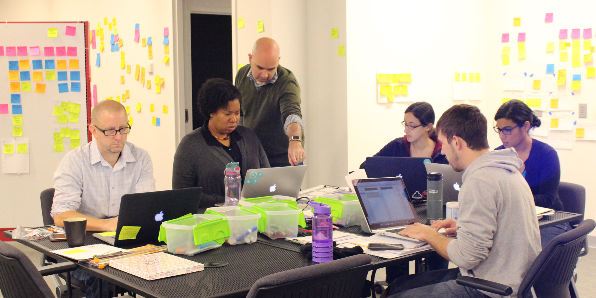
Students are learned sketching and prototyping skills through experience mapping and storytelling from Chris Risdon. Students learning sketching and prototyping skills through experience mapping and storytelling from Chris Risdon.

In November, Adaptive Path’s Capital One’s Chris Risdon came to the school and kicked off their second course, Sketching and Prototyping. Chris taught the students a simple visual language for sketching ideas and explored various methods for creating interactive prototypes. Our students quickly saw why having a working rendition of their ideas to show stakeholders and test with users was beneficial.

That brought us to December when Abby Covert blew students’ minds with her information architecture workshop. For most of them, this was their first exposure to IA’s central tenets of order and clarity. Abby got them thinking about the meaning behind a design’s words, and how those words help users realize their goals with a website or application.

The students then took their User Research Practices course, which was kicked off by the Center for Civic Design’s Dana Chisnell, author of the Handbook of Usability Testing. Dana taught our students that research starts with observations where one derives inferences, which will eventually lead to design decisions to improve the design. She covered the details of executing a user research study, from participant recruitment to session moderation, and through synthesizing the results to uncover insights about the users and how they used the design.

Three weeks ago, the students met A.I.R. Lab’s Seun Erinle to take a deep dive into Front-End Development. Seun taught the basics of HTML, CSS, and Javascript. We believe that every designer benefits when they know enough code to create simple prototypes, pattern libraries, and style guides. Using front-end code is a fantastic way for a designer to communicate their design’s intent to their team’s developers.

Learning to Gain Competency

When we were creating the Center Centre program, Dr. Leslie Jensen-Inman, my co-founder, and I wanted a way to ensure our students would develop the skills necessary to be UX designers. From this, the idea was born to measure each student’s progress based on a set of course-specific competencies.

The competencies we’ve developed have worked better than we could’ve imagined. Before each industry expert arrives to teach their workshop, we hand each student that course’s competencies.

Competencies are how we measure each student’s progress. They replace tests and papers to tell us what a student has learned.

Our competencies work like scouting merit badges. Each competency is made up of a series of demonstrable achievements. As the students complete their studies and project work, they have opportunities to check off the achievements. Completing all of a competency’s achievements tells us the student has developed another necessary skill to becoming a successful designer.

The competencies come directly from Leslie’s and my many years of research into what UX designers need to know. (Leslie wrote her doctoral dissertation on real-world, project-based design education, and UIE studied designer practices for more than 20 years.)

From this research, we’ve boiled each of the 30 courses into demonstrable skills. For example, here’s what each student needed to demonstrate they’ve done to pass the Information Architecture course:

  • They’ve isolated and described an information architecture from an existing design.
  • They’ve created a site hierarchy diagram (often called a site map).
  • They’ve developed a design’s navigation menus.
  • They’ve developed a taxonomy to organize an extensive information collection (like a repository of articles).
  • They’ve developed an information architecture that they’ve optimized for multiple information-seeking behaviors (like exploratory browsing or re-finding something previous located).

We know hiring managers will carefully interview our graduates, holding them to high expectations. We wanted to make it easy for our students to show what they can do. The work our students do to accomplish each competency gives them great stories for those in-depth interview questions like “Tell me about a time when you had to organize complex information” or “Tell me about an application’s navigation that you designed.”

We couldn’t be more pleased with the students’ progress. It’s been challenging, but they’ve been accomplishing one competency after another. It’s fun watching them go from zero knowledge to demonstrating proficiency in the skills. They see their own growth, and that’s motivating.

A Resource-Rich Environment for Self Learners

In today’s design environment, a designer can’t know everything. The design world changes too fast. We’re always discovering things about the domains we’re designing for, the challenges we’re trying to overcome, and the users we’re working to delight.

The best designers learn how to learn. The most important thing we can teach our students is how to teach themselves what they’ll need to succeed. We’ve created an environment for them to do just that.

After each industry-expert workshop, our students spend three days teaching themselves the building blocks for each competency, under the guidance of our Facilitators (our full-time faculty). Each student starts by developing their own Personalized Learning Plan, selecting a variety of resources—books, articles, videos, and online tools—to thoroughly study the course subject and start practicing their newly-learned skills.

We’ve compiled an extensive starter list of resources. However, students need to find additional resources themselves. They gravitate to the resources they learn from best. Some students prefer to watch videos (and we’ve made UIE’s All You Can Learn library available for them) while others want to read books or articles.

One of the best things about our first term was watching the students realize that independent learning is enhanced when you work in a group. Initially, they tackled their personalized learning plans quite independently. By the second course, they had discovered the benefits of sharing their progress and resources. They meet together regularly now, to get ideas, encouragement, and a sense of progress from their peers.
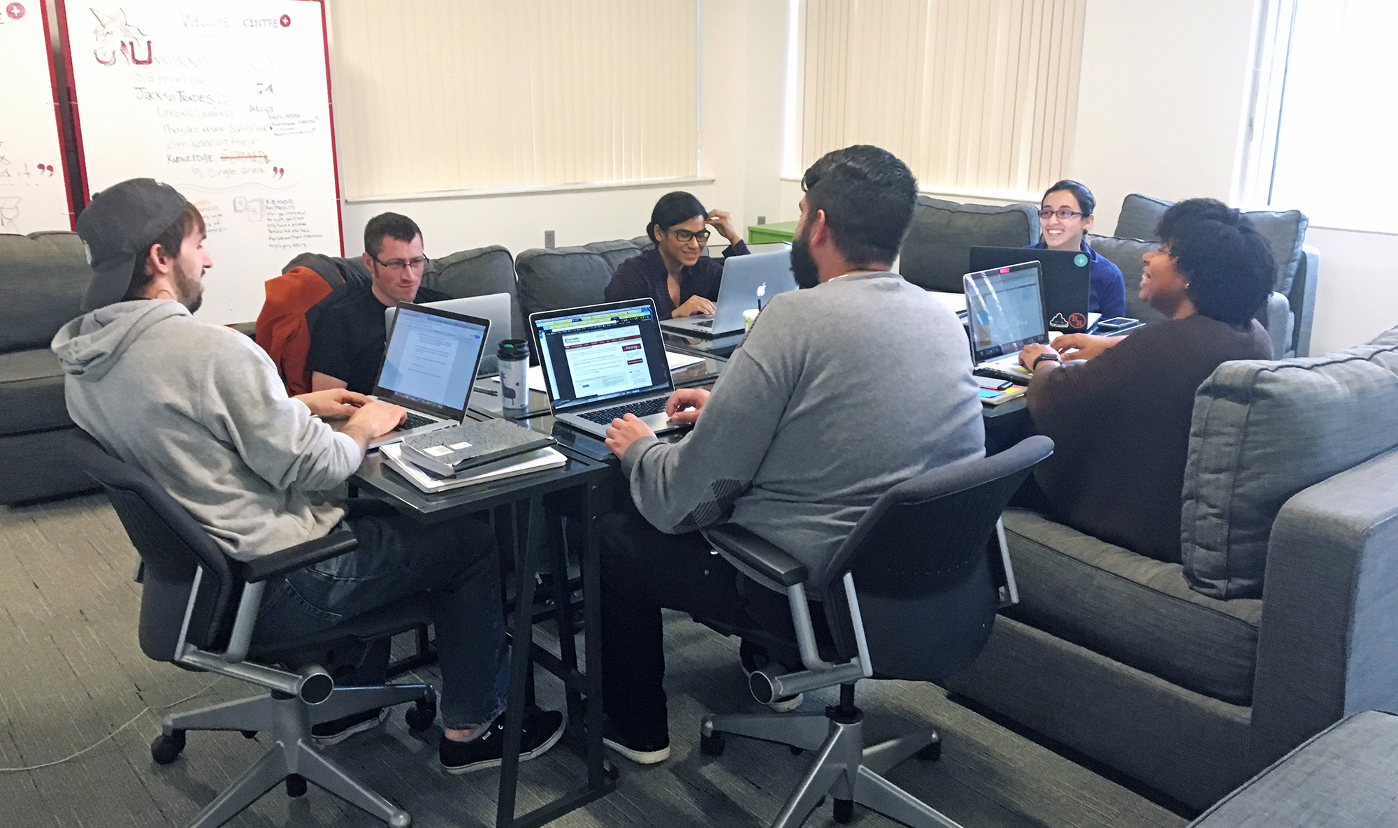
Students review their course competencies together. As a team, they learn, plan, and answer questions around UX skills. Students review their course competencies together. As a team, they learn, plan, and answer questions around UX skills.

Every time they assemble their spontaneous learning group to share what they’re uncovering, I find myself smiling from ear to ear. They are supporting each other’s learning. This type of collaboration is what we’d hoped we’d see from the students.

Alicorn: The Student Group Project for Term 1

Design is a maker’s craft. If you’re not making something, you’re not really designing.

From our very first concepts for Center Centre, we knew we wanted students always to be creating and building designs. That’s where group projects come from.

This group of students got an assignment right out of the gate: Build a tool for collecting and sharing UX design resources. Think of it as a Hacker News or Reddit specifically for design. The students came up the project name of Alicorn. (An alicorn is the horn portion of a unicorn.)

The students will work on Alicorn during six consecutive three-week courses. They’ll collectively invest more than 2,500 hours into the project.

They started the project with design research. They studied similar existing sites, like Hacker News, Reddit, and Stack Overflow. They pulled out common patterns and themes.
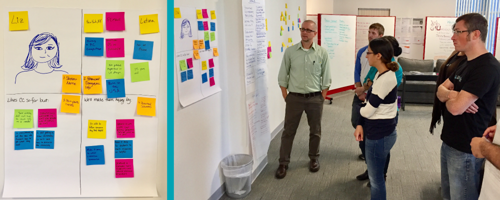
Students created their first proto persona, Liz, for project Alicorn. Students created their first proto persona, Liz, for project Alicorn.

Next, the students built journey maps from what they saw. They created sketches and prototypes of potential design ideas. They built out a provisional category taxonomy and structured the navigation. And they’ve been usability testing their prototypes.

They’ve been applying their coursework to the project because you don’t really learn how to design until you roll up your sleeves and make it happen. And they’ve learned a lot.

We purposely chose our term one courses. Sketching, prototyping, IA, user research, and even basic front-end development are core design activities. Our students will use these skills in every project they do—at the school and after they graduate. We wanted to teach them to do these right from the start.

The students are having fun with Alicorn. Once they complete it, they’ll have to use it to collect the resources for their Personalized Learning Plans. There’s no substitute for using your own design and feeling all the pain and frustration of your decisions. They’ll learn humility and respect for their users.

We plan to open Alicorn up as a resource to the UX community. The resources the students will add to Alicorn are useful to anyone wanting to improve their UX skills. And we’re sure the community has great resources to share with our students. Not only are the students learning to become designers, but they’re also contributing to the community at the same time. That’s the Center Centre way.

What’s Next?

Coming up in term 2 are the next round of foundational courses—visual design, interaction design, critique and design studio, storytelling and scenarios, and copy and content strategy . We’ve lined up great workshop instructors, like Dan Mall, Fred Beecher, Adam Connor, Kim Goodwin, and Ahava Leibtag—all superstars in their own right.

The students will also be wrapping up their work on Alicorn. They’ll start using it themselves for tracking the resources they use in their Personalized Learning Plans. Then they’ll make it public, so you can try it too. Maybe you’ll find some design resources that help you become a more awesome designer?

Once Alicorn is wrapped, the students will start their next three-to-five month project. This project will come from a company, giving the students a chance to get to know a design and development team well. And that team will get to see what our students are capable of, and hopefully, want to hire one or two after they graduate. (We’re always looking for companies to give us projects. If you think you might have a good project for our students, give us a holler.

Our big news, however, is that we’ll be starting Cohort 2 in May. If you know someone who would make a great UX designer and might benefit from an intensive hands-on program, send them our way. Point them to here for more information or send me an introduction. We’d love to meet them and explore if it’s a good match.

Term one is solid proof that hard planning and thoughtful curriculum design produces excellent results. We’re excited for where this class is going and the quality of the designers we’re producing. We can’t wait to see what happens in term two and with our second cohort.

Teaching UX designers to always be learning

By Leslie Jensen-Inman

Teaching UX designers to always be learning

“Of the important things you do every day in your job, what percentage did you learn how to do in school?” When I ask user experience designers this question, most tell me less than 25%. Even those who have only been out of school for just a few years.

In fact, some of today’s best user experience designers never learned design in school at all. They taught themselves what they needed to know. They learned from peers, from seeking out their own resources, and through the painful process of trial-and-error. This is a long and arduous effort, taking them decades to learn everything they know now.

Right now, there’s a high demand for UX designers. Companies need all the designers they can get. They need designers to gain the skills faster. Self-learning is a great approach, but it’s hard to do quickly.

We’ve created our UX Design school, Center Centre, to meet the high demand for UX designers. We needed a program that launched our students on their journey of turning into lifelong self-learners. This meant rethinking the educational process from the ground up.

An alternative to Sage On the Stage

Conventional educational programs use a Sage on the Stage approach, where a smart person stands in front of a classroom pouring facts and raw knowledge into students’ brains. Despite considerable evidence that this approach rarely works, schools still try to teach new skills this way. This is part of the reason why fresh graduates we hire aren’t prepared for the work ahead of them.

People learn best when they take charge of their education. Some people learn well by reading a comprehensive book. For others, books don’t work at all, but they learn when they hear someone explain the concepts and techniques. Everyone has their own way of learning. A good school needs to adapt its learning options for each individual student.

Most skills designers need, they don’t learn in school

Every year, the collection of tools, techniques, and knowledge designers need changes considerably. It’s hard for seasoned professionals to keep up with these changes. Educators find it nearly impossible to update their courses with every new change. This means when students graduate, they’ll need to continually adapt their knowledge to fit the growing discipline. They’ll need to continue learning important skills while on the job.

In addition, there are some things schools can’t ever teach their students. They can’t teach designers about what their users will need or how their users will interact with their designs. Sure, we can teach research techniques to uncover these important details, but the designers can’t learn about actual user needs until they’re working on the job.

Nor can the school teach designers everything they need to know about the domains they’ll work in. Today’s designers are designing an array of interesting problems. Designers help medical professionals deliver better medicine. They provide better financial systems to help the economy. And they help government agencies provide better services to their citizens and constituents.

Schools can’t teach design and all the ins and outs of medicine, finance, or government. In many cases, the designers don’t even know what domain they’ll work in until after they graduate. They’ll have to learn the domain on the job.

Teaching UX designers to always be learning

How do we design a school, knowing what we teach our students will only be 25% of what they’ll use when they’re on the job? By ensuring that what we give them builds a strong foundation for everything they’ll learn after graduation.

That’s why, at Center Centre, we’ve implemented a three-pronged approach to our program. We ensure our students embrace their journey into life-long learning.

The first prong is to provide students with the latest expertise. During their two years as a Center Centre student, they’ll each take thirty classes. Each class starts with a two-day workshop taught by a leading industry expert.

For example, for the User Research Practices course, we’re bringing in world-renown expert Dana Chisnell (who literally wrote the book on usability testing, coincidentally called The Handbook of Usability Testing.) In her workshop, Dana will take the students through hands-on activities. Students will learn user research techniques such as usability testing and field research. They’ll explore what it takes to plan, moderate, and observe usability tests, along with how to synthesize the observations into solid design decisions.

Every three weeks, our students will meet a new industry expert as they start each new course in the Center Centre UX Designer curriculum. Each time, they’ll learn the essential skills for that topic through the expert’s hands-on workshop.

Providing a resource-rich self learning environment

The second prong is the rich collection of resources we provide. We’ve filled our library with the latest books, adding new ones every month. Every student has access to state-of-the-art online training tools like UIE’s All You Can Learn, lynda.com, and teamtreehouse.com. We give each student a brand-new MacBook Pro, loaded with the latest design software. They’ll be learning with the same tools they’ll use when they’re on the job.

Our full-time faculty—we call them facilitators—spent months compiling resources for each course. They’ve identified the seminal articles, helpful videos, and other materials to answer any student’s question.

The facilitators monitor each student’s progress and tailor each student’s education to help that student learn best. Facilitators work with each student to create a personalized learning plan. Each student crafts this unique plan to achieve learning goals for the course. More importantly, the facilitators work alongside the students to identify relevant, high-quality learning resources. Our students get the practice of knowing where to look when they need to learn something new.

Practice through experience

The final prong is the project work. Center Centre students will spend more than two-thirds of their education working on real-world projects. We designed these projects to give them exactly the real-world experience they need.

Companies and nonprofit organizations submit projects for our students to work on. (We’ll even have a few of our own, so our students can build designs they’ll have to use themselves. It’s always eye-opening when you have to “eat your own dog food,” as the kids like to call it.) The students will work on projects from concept all the way through deployment and beyond. They get the entire experience of building and measuring a design.

Each project will integrate the techniques our students learned so far, plus some techniques they haven’t yet encountered. For example, before Dana shows up to teach her User Research Practices course, the students will have already observed live usability tests during their project work. That way, when Dana gets there, she’ll build on the experiences they had, explaining the underlying theory that made it all work.

On-the-job learning, intentionally designed

We started with a premise: We need to prepare our students to be lifelong learners. This forced us to rethink how to build Center Centre. We knew we had to cherry-pick the best UX techniques to give our students a solid foundation. We ended up with a modular curriculum. We can quickly update our courses to accommodate the latest, best practices and tools.

Most importantly, we’ve infused every course and project with the educational goal of teaching students to improve their own learning capability. Every Center Centre graduate will be ready to learn exactly what they need to create the best designs, no matter the circumstances. They’ll be lifelong, self-driven learners.

Think you’d like to be a Center Centre student? Know someone looking for a career upgrade? We’re still accepting students for our Oct 17 starting class. More info at centercentre.com/apply.

Big news! Center Centre’s first students will start on October 17!

By Leslie Jensen-Inman

Big news! Center Centre’s first students will start on October 17!

We’re starting classes at Center Centre on October 17th! I couldn’t be more excited.

For the team and me, setting our start date is a big deal. We’re ready to dial up our recruitment process, looking for folks who are ready to shift their career and become an industry-ready user experience designer. And I need your help.

October 17 is when our first students will begin with Induction—the week-long introduction to what their next 2 years will be like. Then they jump right into their first class, my Introduction to UX course, followed by Information Architecture, Sketching & Prototyping, User Research Practices, and Front-End Development. And that’s just the first term—there are five more terms right after that.

During the 2 years, they’ll work on 5 to 8 industry-grade projects, from concept through deployment, learning how to integrate UX design at every phase. They’ll work through courses led by 30 industry experts and our full-time faculty.

We’ve intentionally designed every moment of their Center Centre education. They’ll develop the skills and practice the techniques that will make them awesome UX designers, ready to enter the workforce.

I need your help to find the students for the first class. We have the financing for twenty-two students to complete this adventure. We’re looking for motivated self-learners who are ready to be immersed in a program that will give them a new career.

Do you know someone who would make an amazing student? Do you know someone who could become a top-grade user experience designer?

If you know someone who would make a fantastic designer, please introduce them to us right away. Have them look over what becoming an industry-ready designer could be like. When they’re ready, they can contact us. We’ll be glad to give them all the details and answer all their questions, so they can learn if Center Centre is the right choice.

I appreciate you helping me find our first students.

Jared

Choose your own adventure to learn IA basics

By Jessica Ivins

Choose your own adventure to learn IA basics

Center Centre students get to choose their own learning adventures. We don’t require students to learn from one, specific resource. Instead, students choose resources and experiences that meet their learning styles and learning needs.

Our students develop their own learning adventures to gain skills like information architecture. Information architecture (IA) is how designers organize everything in a design to help users find the specific content they’re seeking.

If you’d like to learn more about IA, use some of our favorite resources listed below to develop your own learning adventure.

Books

  • How to Make Sense of Any Mess is a charming book that makes IA principles understandable and accessible. It’s also a quick read.

  • UX designers call Information Architecture for the Web and Beyond, “The Polar Bear Book” because of the bear on its cover. Now in its fourth edition, this book is an essential IA resource because it takes a deep dive into IA.

  • In A Web for Everyone, Chapter 6, “Helpful Wayfinding: Guides Users” explains how IA helps all users, including people with disabilities.

Articles

Videos

  • How to Make Sense of Any Mess explores multiple IA concepts. The presenter explains how there’s no right way to organize information. She shows you effective ways to organize information based on your business and your customer.

  • The Five Hat Racks reviews the five ways of organizing information. You can watch this video instead of reading “The Only Five Ways to Organize Information (Five Hat Racks or LATCH)” article above.

Podcasts

Become a Center Centre student

Do you want to learn how to organize your site’s content so that it’s understandable to your organization and your users? Would you like to become a well-rounded, industry-ready, junior UX designer? Apply to be a Center Centre student. View our full program or apply today

Alt text is part of your site’s content

By Jessica Ivins

Alt text is part of your site’s content

Clear, conversational writing helps users understand what they read on your website. It also helps users understand the content in your images’ alt text.

Alt text is more than just a few words that you quickly add to an image attribute. Images, like text, are part of your site’s content. When people can’t access the images on your site, alt text helps them understand your content.

In her accessibility guide, Accessibility Teaching Resources, Virginia DeBolt explains how you can write meaningful, useful alt text:

Think about alt text by imagining you are reading a web page to someone over the phone. When you come to an image that adds meaning to the content, what words do you use to describe the image to the person you were talking to? The image should be meaningful in the context of the content of the page, and the alt text should explain that meaning.

Read your alt text out loud

After writing the alt text, read it out loud. Reading your content out loud helps you determine if the content is appropriate and written in a friendly, non-robotic tone. Kate Kiefer Lee, communications director at MailChimp, explains this technique on her blog:

As you read aloud, pretend you’re talking to a real person and ask yourself “Would I say this to someone in real life?” Sometimes our writing makes us sound stodgier or colder than we’d like.

Remember to keep alt text short

Write meaningful, human-relatable alt text. Keep alt text as brief as possible without sacrificing clarity. Concise alt text helps someone, who is using a screen reader, get the gist of the image quickly.

In our previous post about alt text, we asked you to imagine you’re designing a website for a robotics product called WidgetWonder. Your website displays a photo of kids using WidgetWonder products at home. Alt text for this photo could say something like, “Two kids build a remote-controlled car in their kitchen with WidgetWonder.” This alt text explains a lot about the image. It’s also relatively short (about 75 characters).

Learning accessibility at Center Centre

We’ve baked accessibility into our program at Center Centre. In our courses, students learn accessibility tips that are relevant to each course. For example, the Copywriting and Content Strategy course helps our students learn how to create content that is useful and accessible to the design’s users. During team projects, students will apply accessibility principles they learn to the designs they build.

Become a Center Centre student

Would you like to learn how to make designs that are accessible for users with diverse needs? Would you like to graduate from Center Centre as an industry-ready, junior UX designer? View our full program or apply today.

When writing alt text, ask yourself this question

By Jessica Ivins

When writing alt text, ask yourself this question

When you build a website, it’s good practice to include alt text (alternative text) with images. Alt text describes images on the web.

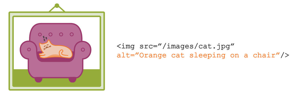
To include alt text, you insert an alt attribute into an HTML image element. An element with an alt attribute might look this:  
 
<img src=”/images/cat.jpg” alt=”Orange cat sleeping on a chair” />

People with visual impairments may rely on alt text to use your site. Some visually-impaired users use screen readers to access the web. When images have alt text, a screen reader reads that text out loud to the user.

While including alt text is straightforward, writing useful alt text takes a bit of thought.

Ask this question when writing alt text for images

Every time you write alt text, ask yourself, “Do I need to describe what this image does, or do I need to describe what this image is?”

For functional images, write alt text that explains the purpose of the image. For example, imagine you’re building a website for your company, WidgetWonder. WidgetWonder’s logo appears in the navigation menu, and it links to the site’s home page.

The alt text “WidgetWonder logo” would accurately describe the logo, but the description isn’t helpful to someone using a screen reader. In this case, someone using a screen reader doesn’t need to know what the image looks like. She needs to know what the image does. Consider using alt text like “WidgetWonder home page” or simply “Home.” This tells her that the logo goes to your site’s home page.  

Sometimes, describing what the image does is most important. Other times, it’s more important to describe the image itself. Decorative images can simply be decorative, or they can be part of your site’s content. When images contain illustrations or photos that give users meaningful information, use alt text to describe what’s in the images.

Suppose WidgetWonder sells robotics products for elementary school-aged kids. A customer accesses your site with a screen reader. She’s shopping for robotics toys for her two children.

Your website displays photos of kids using WidgetWonder products at home. Alt text for these photos could say something like, “Two kids build a remote-controlled car in their kitchen with WidgetWonder.” This alt text tells the customer what’s happening in the photo. It also demonstrates how her children can use your product.

Write alt text that’s useful and accurate

Simply including alt text usually isn’t enough to make your images accessible. The alt text has to be useful. For more information about alt text, and to learn more about accessibility, read Virginia DeBolt’s accessibility guide, Accessibility Teaching Resources.

Learning accessibility at Center Centre

We’ve baked accessibility into our program at Center Centre. Students won’t just learn how to write alt text that’s useful and meaningful to their users. They’ll learn other things like how to write accessible content and how to observe accessibility needs during user research. During team projects, students will apply what they learn about accessibility to the designs they build.

Become a Center Centre student

Would you like to learn how to make designs that are easy-to-use and accessible? Would you like to graduate from Center Centre as an industry-ready, junior UX designer?  View our full program or apply today.  

Build a collection of project work for your UX portfolio

By Jessica Ivins

Build a collection of project work for your UX portfolio

Through our research at Center Centre, we’ve noticed a change in demand for UX portfolios. Today, more hiring managers require UX candidates to have portfolios that showcase their UX skills and experience. Job titles and descriptions on a résumé don’t always show a hiring manager if you have the skills they need. Hiring managers need to see evidence of your design experience to know if you’re a good fit for their team.

Hiring managers want to see more than just finished work in a portfolio. They want to see your work process, from start to finish. An up-to-date portfolio can help you land an interview, and it can help you tell the story of your work process.

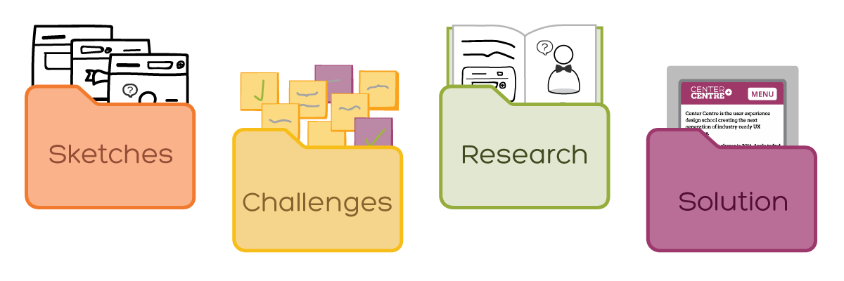
The best way to keep your portfolio up-to-date is to is to document and collect your work over the lifetime of a project. Sit down regularly—about once a week—and take stock of the project. Take photos of your sketches. Collect screenshots of your process. Take photos of the sticky notes on your office wall. For each project, record notes about the challenges, the process, the solution, and the outcome of that project. Your goal is to collect materials that help you tell the right stories in your portfolio.

Keeping an up-to-date collection of your project work allows you to have the materials you need to update your portfolio quickly. You avoid the daunting process of trying to remember everything you’ve done since you started your current job.

An up-to-date portfolio also allows you to make career moves more easily. When your collection is up-to-date, you’re prepared to apply for a job because you can assemble a portfolio in a short amount of time. You don’t have to spend extra time gathering materials to put into your portfolio.

Creating a portfolio doesn’t start when you’re ready to find your next job. It starts long before a hiring manager asks you for a portfolio. It starts when your work starts.  

Creating a portfolio at Center Centre

Shortly after students start classes at Center Centre, we’ll help them learn how to build a collection of materials for their portfolio. As students approach graduation, they won’t rush to create a portfolio from scratch. Instead, they’ll have the pieces they need to construct the story they want to tell through their portfolio.

Become a Center Centre student

Would you like to graduate from Center Centre as an industry-ready, junior UX designer with a portfolio that helps you land an interview? View our full program or apply today

More resources on UX portfolios

To learn more about creating a UX portfolio, pre-order Ian Fenn’s upcoming book, Designing a UX Portfolio. You can also purchase Ian’s seminar, Sharing Our Stories: Designing and Reviewing UX Portfolios, from the All You Can Learn video library.

What work should you include in your UX portfolio?

By Jessica Ivins

What work should you include in your UX portfolio?

In our last post, we explained how a UX portfolio can help you get a job interview. Your portfolio can also support your next career move. You can use your portfolio to get the job that’s right for you, and not just any job that’s available.

What work do you include in your portfolio to get the job you want? How do you know what not to include?

You don’t need to include every project you’ve worked on over the past few years. Ian Fenn recommends showing work that you want to do more of in your portfolio. In his seminar, Sharing Our Stories: Designing and Reviewing UX Portfolios, Ian says this is a great way to land a UX job that you’re good at—and happy with.

For example, if you want to do more user research at your next job, look for UX jobs that involve a lot of user research and create a portfolio that showcases your user research work. Deemphasize other work you’re less interested in doing. In this case, play down things like prototyping, information architecture, and content strategy.  

You can still include a variety of work to show that you’re a well-rounded UX designer. Just make sure to highlight the work you want to do. Remember, your portfolio tells stories about you, as a designer. It tells stories about your past work and where your focus is for future work. A great portfolio helps you get opportunities that align with your skills and interests.

In the next post, we’ll explain how to keep an updated list of work accomplishments for your UX portfolio.

Learn more about creating a UX portfolio

To learn more about UX portfolios, you can pre-order Ian Fenn’s book, Designing a UX Portfolio. You can also purchase Ian’s video seminar, Sharing Our Stories: Designing and Reviewing UX Portfolios, from the All You Can Learn video library.

Become a Center Centre student

Are you transitioning your career to UX design? Would you like to graduate from Center Centre as an industry-ready, junior UX designer with a portfolio of your work? View our full program or apply today